Willa Wanders Everyday Watercolor Palette
The exact colors I use, why I chose them, and my favorite substitutions.
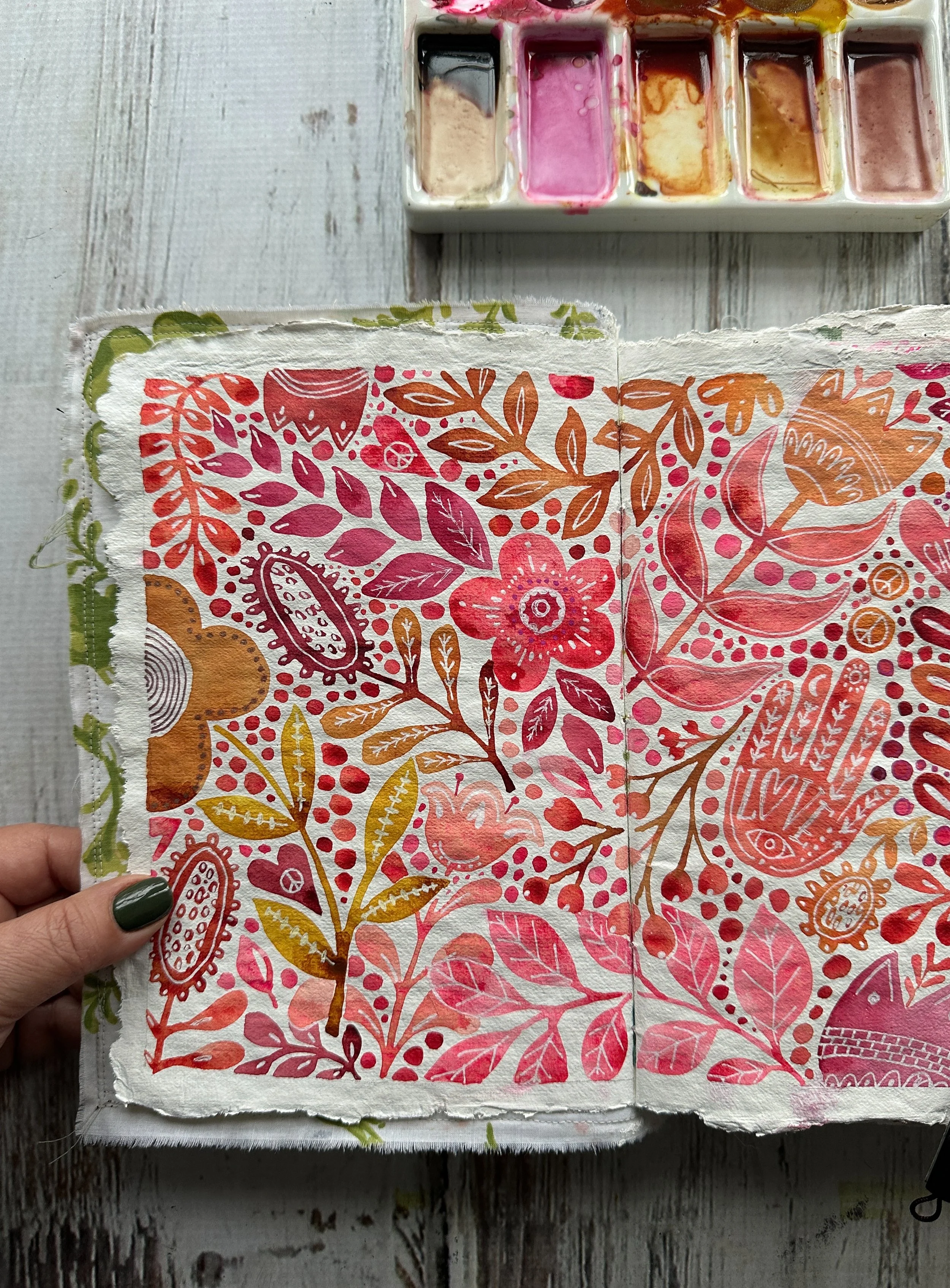
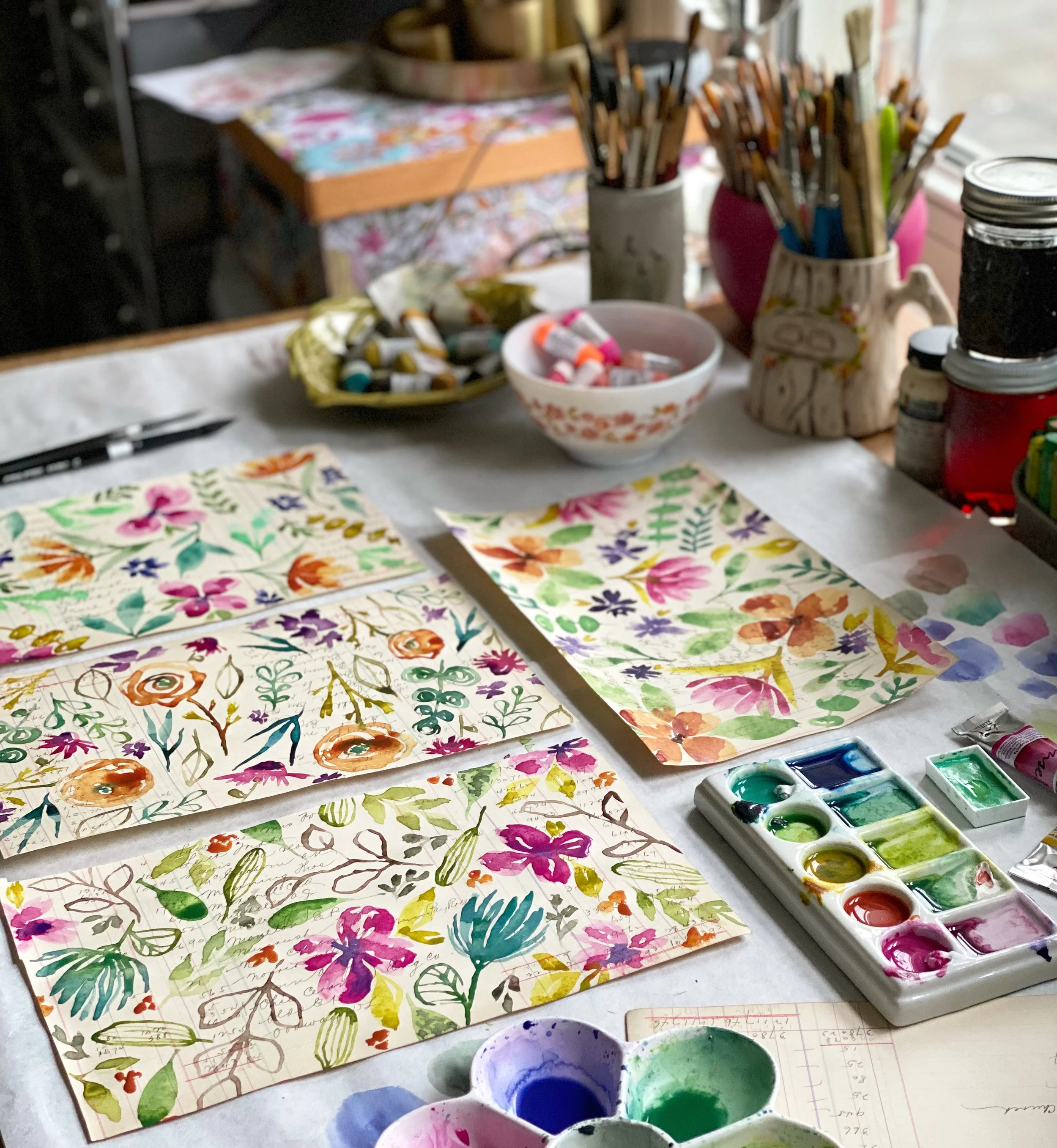
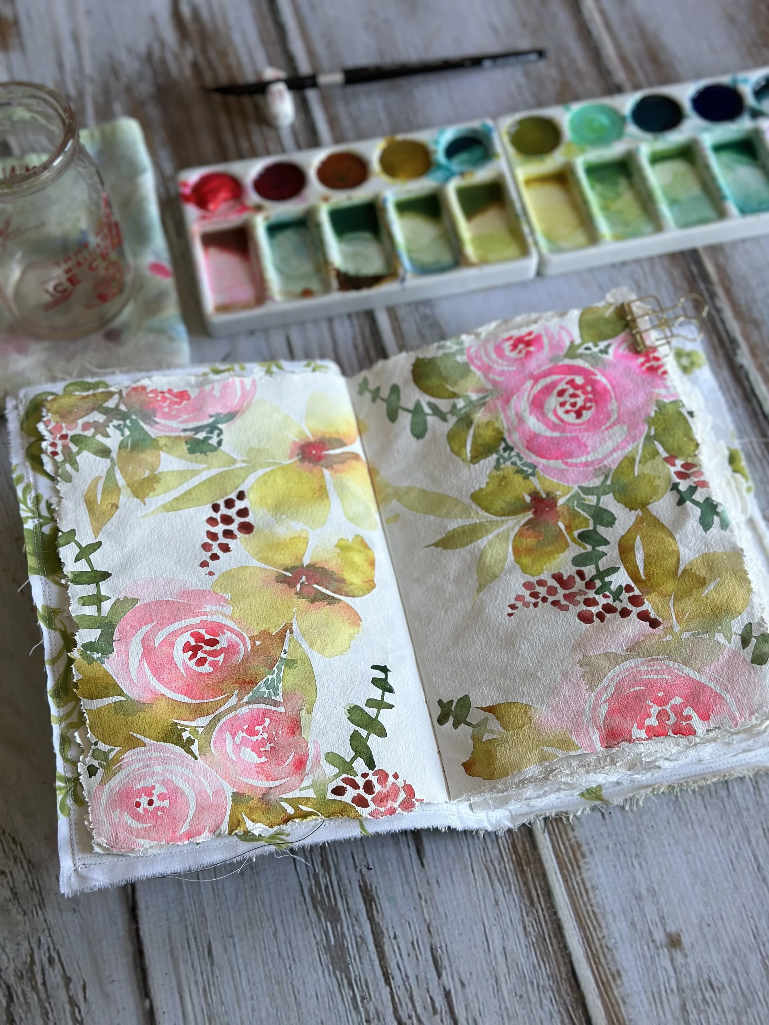
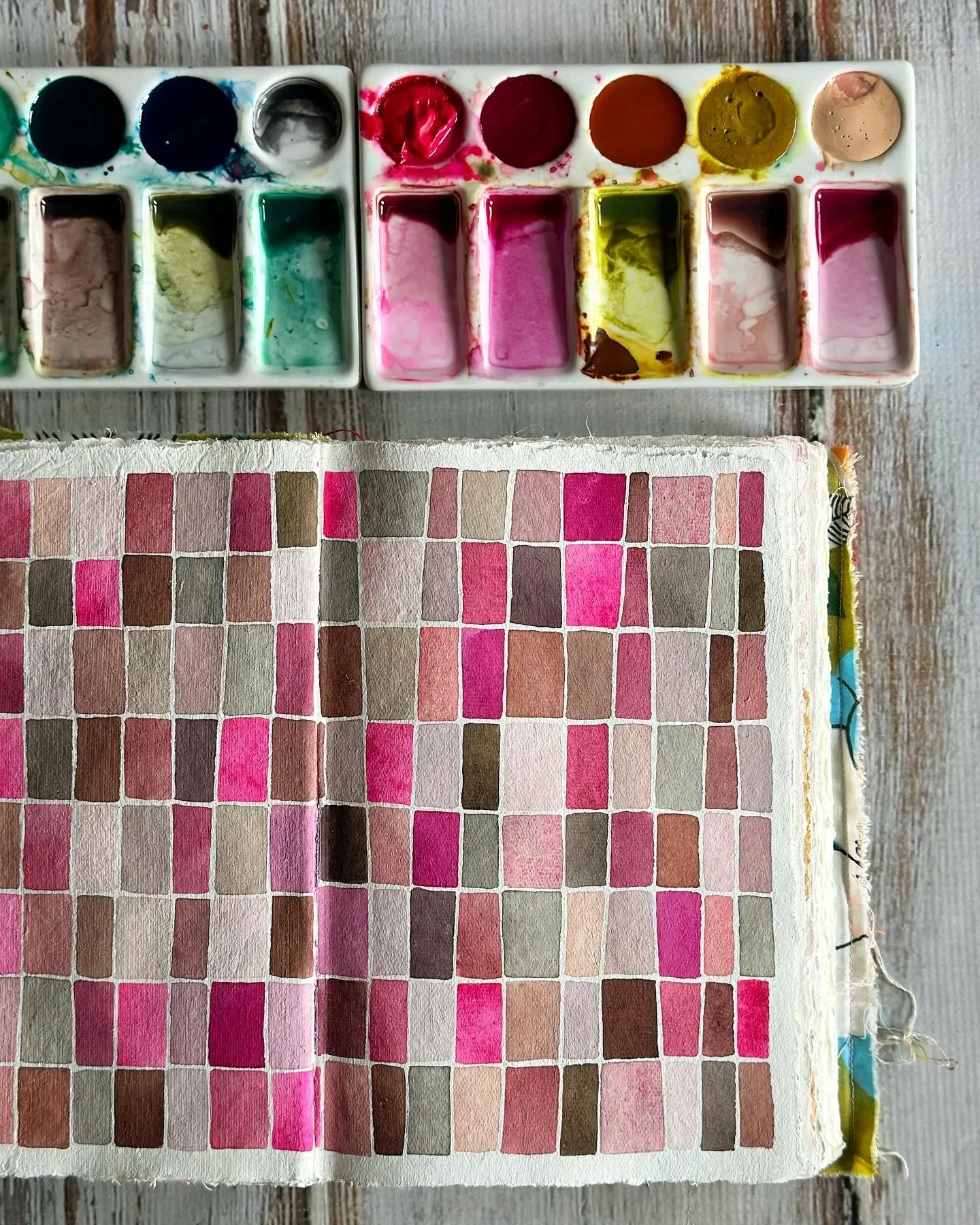
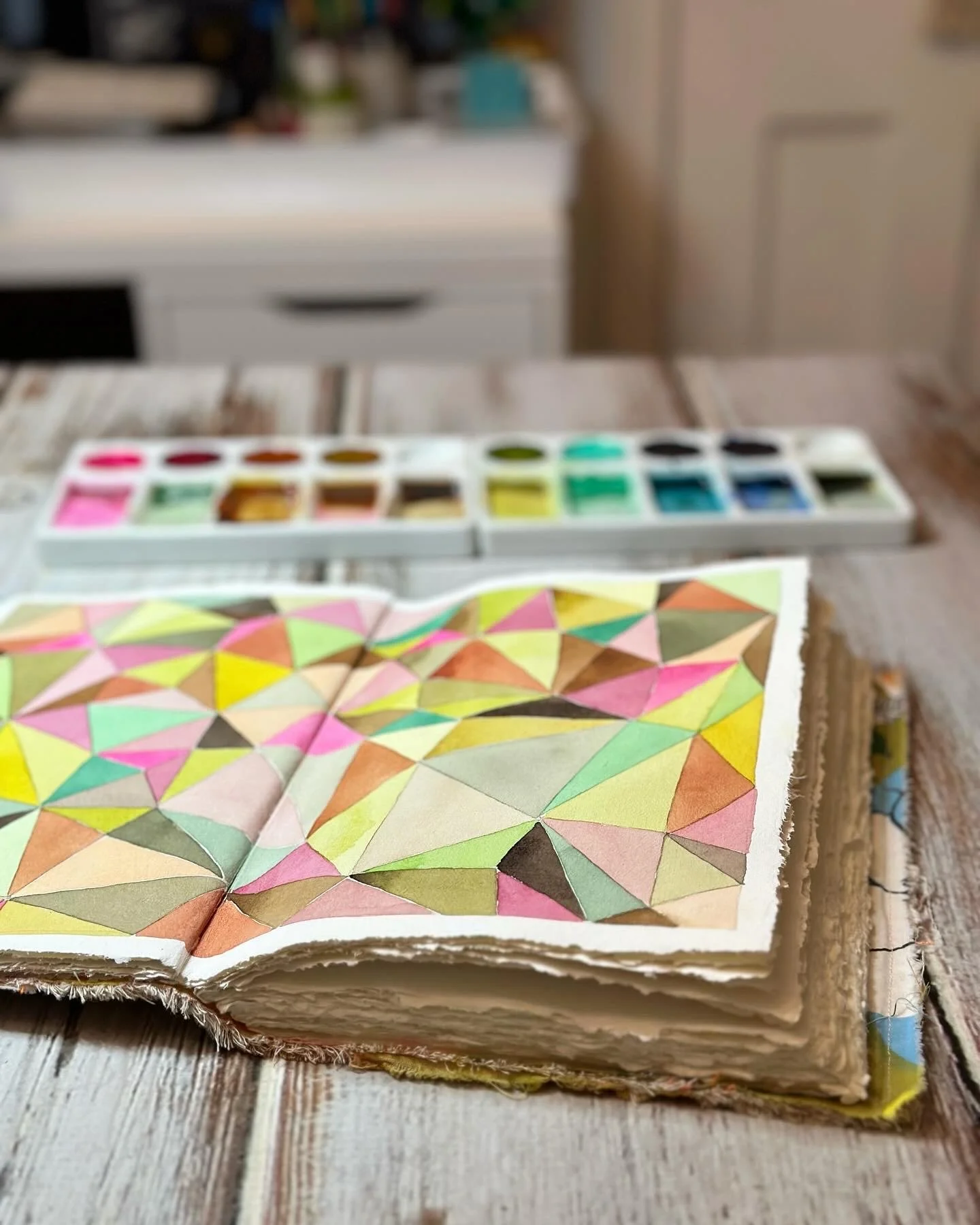
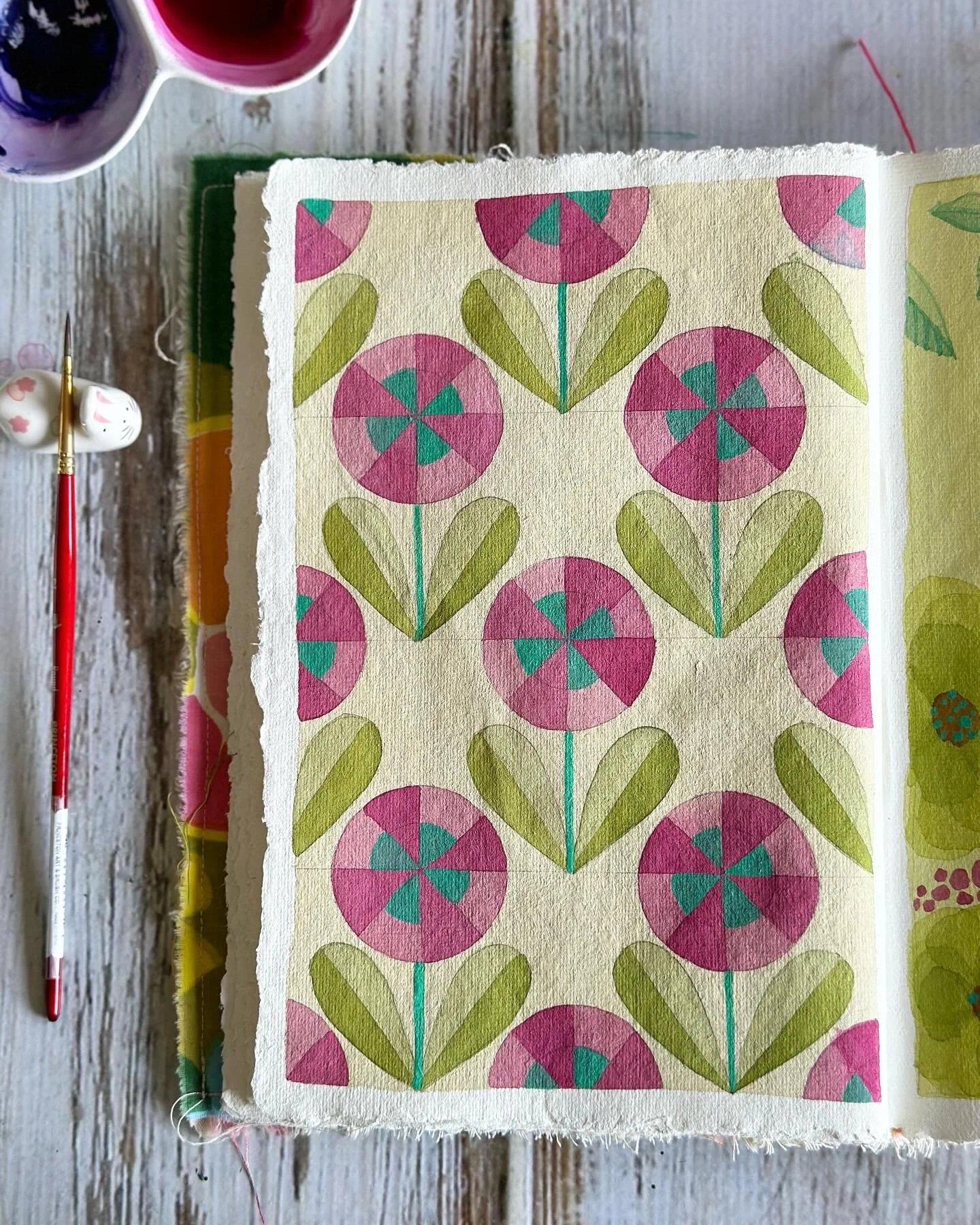
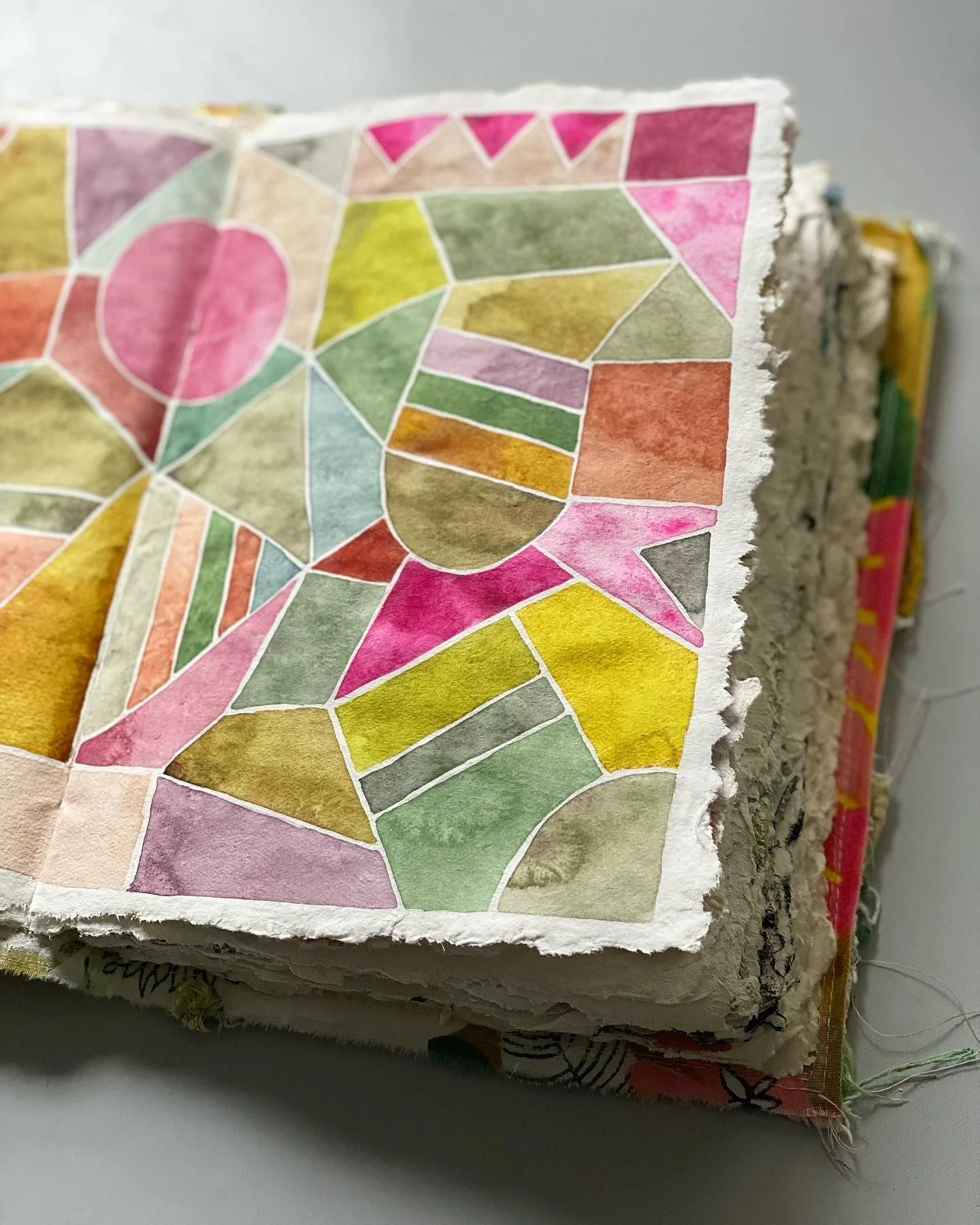
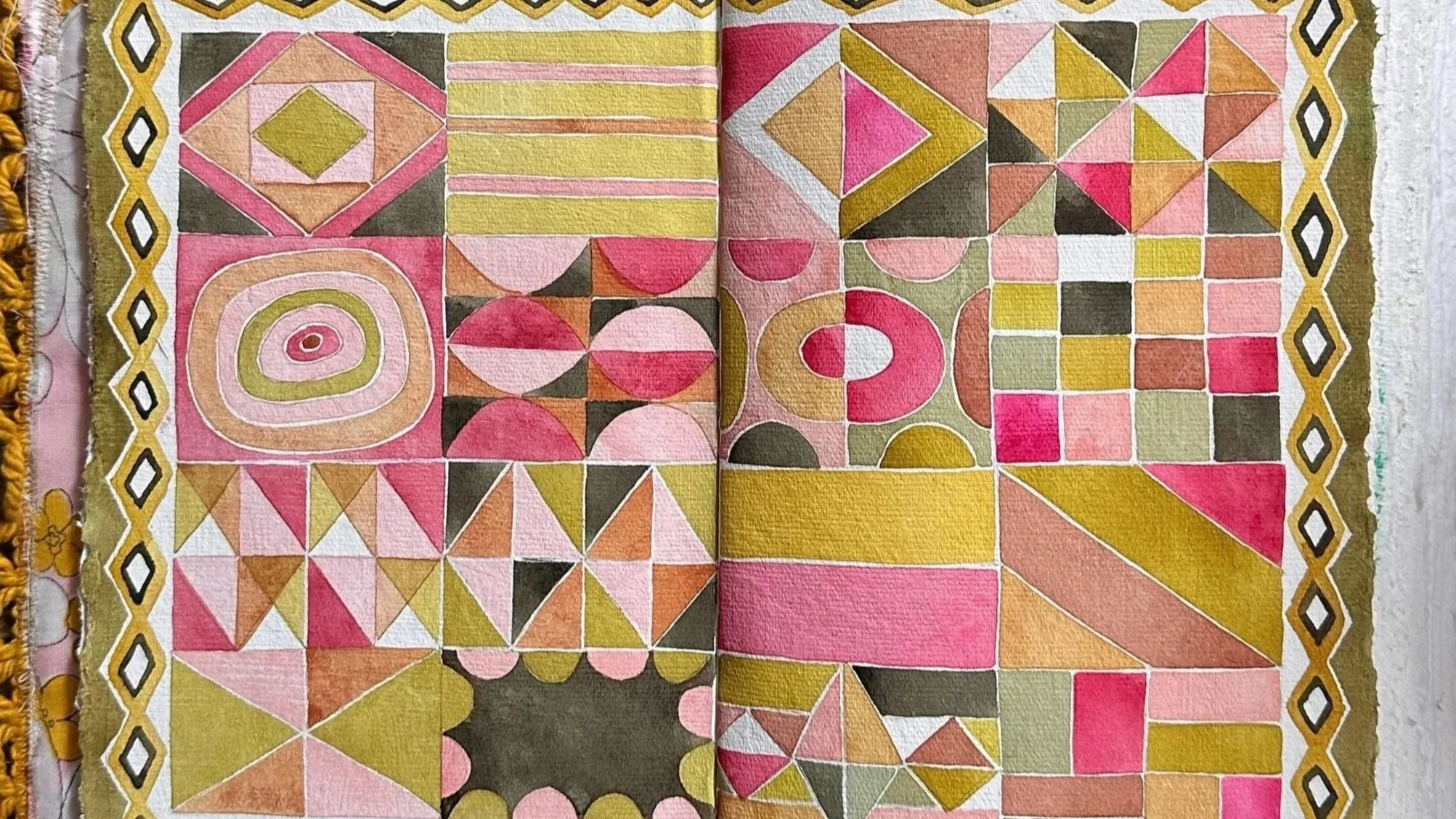
I have many watercolor palettes, but this is the watercolor palette I reach for almost every time I paint. After years of experimenting, these are the colors I love most because they mix beautifully together and fit my fun, loose, colorful painting style.
A Note About Substitutions
I chose these colors because I love the way they mix together—not because they are the only correct choices.
If you can't find an exact color, don't worry! I've listed my favorite substitutions below. The goal is to match the function of the color in the palette, not necessarily the exact brand.
To browse the Watercolor Painting courses on Willa Workshops, click here.
For specific lessons on how I mix these colors into an infinite number of amazing hues, please consider taking my course Watercolor for Relaxation.
To learn how to make your own Watercolor sketchbooks the way I do it, click here.
My Everyday Watercolor Palette
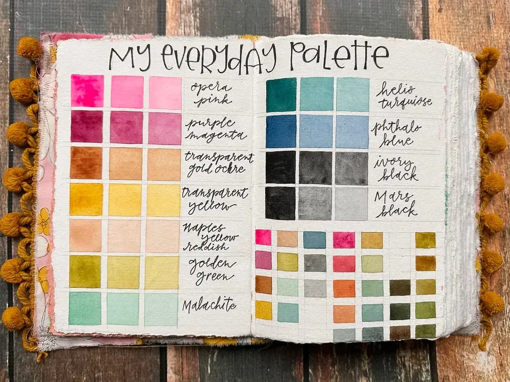
❤️ Opera Pink
❤️ Purple Magenta (Primary Red)
🟤 Transparent Gold Ochre (Earth Mixer)
💛 Transparent Yellow (Primary Yellow)
🌼 Naples Yellow Reddish
🌿 Golden Green
🍃 Malachite
🔵 Helio Turquoise (Warm Blue)
🔷 Phthalo Blue (Cool Blue)
⚫ Black
Renesans Watercolors
I mostly paint with the Renesans Polska brand of watercolors because I find that they are a great value in artist grade watercolor paint, but most brands of watercolors are perfectly wonderful to paint with. Honestly, with the way that I mix my colors, almost any brand of watercolors at any price point is really fun to use.
All Renesans colors listed below are available in North America through an Etsy shop called A Little Creative Me, the only North American distributor of Renesans Polska Watercolors.
Save 10% with discount code: WILLA10
If you live outside the USA or Canada, contact Renesans at biuro@apapolska.pl to find your local dealer.
❤️ Opera Pink
Purpose: I use Opera Pink for vibrant florals and to create glowing oranges, corals, and pinks that simply can't be mixed from other pigments.
Pigments: PR122, BV10
Recommended colors:
• Mijello Mission Gold — Bright Opera
• Holbein — Quinacridone Opera
❤️ Purple Magenta (Primary Red)
This is my primary red. A great primary red is a must have in a mixing palette.
Pigment: PR122
Recommended colors:
• Mijello Mission Gold — Quinacridone Permanent Magenta W519
• Sennelier — Helios Purple (formerly Quinacridone Purple)
• Holbein — Quinacridone Magenta
• Winsor & Newton — Quinacridone Magenta
• Schmincke — Quinacridone Magenta
• Daniel Smith — Quinacridone Lilac
🟤 Transparent Gold Ochre (Earth Mixer)
This is my favorite earthy yellow.
I use it constantly to make beautiful natural greens with blues and to warm almost every mixture on my palette.
Pigments: PY150, PR101
Recommended colors:
• Renesans — Transparent Gold Ochre
If you can't find it...
Simply mix:
• Transparent Yellow (PY150)
with
• Winsor & Newton — Burnt Sienna (PR101)
You'll create an excellent substitute.
Other similar colors:
• Daniel Smith — Quin Gold Deep (PO49, PY150)
• Daniel Smith — Quinacridone Gold (PO48, PY150)
💛 Transparent Yellow (Primary Yellow)
This is my primary yellow. I could not live without a transparent yellow to mix with!
Pigment: PY150 (Nickel Azo Yellow)
Recommended colors:
• Renesans — Transparent Yellow
• Daniel Smith — Nickel Azo Yellow
• M. Graham — Nickel Azo Yellow
• Winsor & Newton — Transparent Yellow
• Schmincke — Transparent Yellow
🌼 Naples Yellow Reddish
I love this warm buttery peachy color because it softens mixtures and adds warmth without overpowering them. It is much more like a traditional gouache than it is a watercolor because it is fairly opaque. This is a serious bonus color, and if you are just getting started and you are on a budget, I would skip this color for now. But if you are ready to really dive in, consider it.
Recommended color:
🌿 Golden Green
This is one of my favorite convenience colors. You can absolutely mix this color from yellow and blue, but I have this in my palette because I use so much green that it is a bit easier to start with a yellow green in my palette. I love it straight from the pan as well as using it for mixing.
Pigments: PY3, PG7, PY150, PY151, PBr6
Recommended colors:
• Daniel Smith — Rich Green Gold
🍃 Malachite
This is another convenience bonus color that I absolutely love.
I don't use it for realistic greens. I use it because it adds a lot of personality to my watercolor painting. It is a little freaky-deaky, but oh boy is it fun! It is wonderful in all of my watercolor pattern painting for relaxation as well as the loose florals, leaves, and even backgrounds.
Recommended colors:
🔵 Helio Turquoise (Warm Blue)
This is my warm blue. A warm blue is a must have in a mixing palette.
Pigments: PG7, PB15:3
Recommended colors:
• Daniel Smith Phthalo Turquoise
• Daniel Smith Ultramarine Turquoise
🔷 Phthalo Blue (Cool Blue)
This is my cool blue.
Pigment: PB15
Recommended colors:
• Winsor & Newton — Winsor Blue (Red Shade)
• Daniel Smith Phthalo Blue Red Shade
⚫ Blacks
I actually recommend having two blacks available because they serve very different purposes.
PBk9 – Ivory Black
I use Ivory Black to neutralize colors far more often than Payne's Gray or Neutral Tint. It creates softer, more natural mixes that harmonize beautifully with quinacridones, earth pigments, and botanical palettes.
Recommended colors:
• Winsor & Newton Professional — Ivory Black
• Schmincke Horadam — Ivory Black
PBk11 – Mars Black / Lunar Black
I use this as my "special effects" black whenever I want bark, stone, weathered paper, expressive granulation, or dramatic texture.
Recommended colors:
• Winsor & Newton Professional — Mars Black
• Schmincke Horadam — Mars Black
One Last Thing...
Please don't feel like you need to own every paint on this list before you start painting.
This palette evolved over many years of experimentation, and these are simply the colors I reach for over and over again because they make me happy and inspire me to paint.
Use what you have. Paint often. And if, over time, your palette begins to look a little more like mine, I hope these colors bring you as much joy as they've brought me.
Happy painting!
— Wendy aka Willa
Affiliate Disclosure: Some of the links in this guide are Amazon affiliate links. If you purchase through one of these links, I may earn a small commission at no additional cost to you. Thank you for supporting my work and helping me continue creating free tutorials and resources for the creative community.
I adore painting with watercolors!